
Minimalism has become one of the most effective and popular approaches to logo design. Simple, clean logos are more than just a design trend – they have real power to convey a brand’s message clearly and memorably. In this article, we’ll explore why minimalist logos are so effective and why they continue to dominate branding strategies. This article was prepared by the experts at Turbologo.
What is a minimalist logo and why does it work?
Minimalist logos are designs that focus on simplicity, removing unnecessary details while keeping only the essential elements that represent the brand. They usually feature clean lines, simple shapes, and limited color palettes. The purpose of these logos is to communicate the brand’s message in the most straightforward and effective way possible — something you can easily achieve with the help of a logo maker.
The power of minimalist logos lies in their ability to:
- Enhance brand recognition: With fewer elements, a minimalist logo is easier to remember. Its simplicity ensures that it can be recognized instantly by consumers.
- Convey clarity and confidence: Minimalist logos tend to exude a sense of confidence. They’re not bogged down by unnecessary details, allowing the core message of the brand to shine through.
- Appeal to modern sensibilities: Today’s audience is accustomed to streamlined, user-friendly designs. Minimalist logos resonate with a generation that values clarity, efficiency, and simplicity.
How minimalist logos align with modern branding trends
In recent years, the trend toward minimalist design has taken the world by storm, not just in logo design but across all areas of branding. Brands are looking for ways to stand out in a crowded marketplace, and minimalist logos are an excellent solution.
Some of the reasons minimalist logos are in demand include:
- Adaptability: Simple logos are highly versatile. They look just as great on a website as they do on physical products, social media profiles, and even on mobile apps.
- Scalability: Minimalist designs maintain their clarity and integrity even when resized. Whether your logo is displayed on a small business card or a large billboard, it remains recognizable.
- Timeless appeal: Minimalist logos avoid trendy design elements that may become outdated. Instead, they rely on timeless principles of design, ensuring they’ll stay relevant for years to come.
The psychology behind minimalist logo design
Minimalist logos do more than just look aesthetically pleasing. They tap into fundamental principles of psychology to make an impact. These logos resonate with consumers because they speak directly to our cognitive processes, creating a lasting impression in a short amount of time.
Key psychological benefits of minimalist logos include:
- Clarity over complexity: People are naturally drawn to simple, clean designs because they’re easier to process and understand. Minimalist logos leave little to the imagination, allowing your brand to communicate quickly and effectively.
- A sense of trust and professionalism: Simple logos often feel more professional because they give the impression that the brand is confident enough to keep things straightforward, rather than complicating their message.
- Increased memorability: Studies show that we remember simple designs more effectively than complicated ones. The brain processes simple logos faster, making them easier to recall when needed.
How to create a minimalist logo that resonates with your audience

Creating a successful minimalist logo requires more than just stripping away elements. It’s about finding the right balance between simplicity and meaning. To create a minimalist logo that truly resonates with your target audience, consider the following tips:
- Focus on the essence of your brand: What does your brand stand for? What message do you want to communicate? Focus on the core attributes of your brand and let these inform your design choices.
- Choose a limited color palette: Minimalism often calls for a limited number of colors. Stick to a few shades that represent your brand’s identity. Black and white logos, for example, are often highly effective in their simplicity.
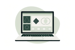
- Use geometric shapes: Geometric shapes like circles, squares, and triangles can convey a sense of order and structure. These simple shapes are often more memorable and easier to reproduce.
- Typography matters: The font you choose can make a big difference. Opt for a clean, simple font that’s easy to read and complements your minimalist design.
The benefits of minimalist logos for businesses
Adopting a minimalist approach to logo design offers several advantages for businesses, both in terms of branding and long-term success.
Some of the key benefits of minimalist logos include:
- Versatility: As mentioned earlier, minimalist logos are adaptable to different formats. Whether you’re using your logo online, on social media, or in print, it will retain its effectiveness across platforms.
- Cost-effectiveness: A simple logo often requires less time and fewer resources to design and produce. This can be particularly helpful for small businesses or startups working with a limited budget.
- Stronger emotional connection: While minimalist logos are simple in appearance, they can still create a strong emotional connection with consumers. A well-crafted minimalist logo can communicate trust, professionalism, and confidence, which builds loyalty over time.
- Better brand recognition: The simplicity of minimalist logos makes them easier to identify and remember. Consumers are more likely to recall a brand with a simple logo, especially in an overcrowded marketplace.
Is minimalist design always the right choice for your brand?
While minimalist logos offer many advantages, they aren’t the right choice for every brand. Whether a minimalist logo is appropriate depends on your business, industry, and overall brand identity.
Here are some questions to ask when deciding if minimalist design is right for your brand:
- What message do you want to convey? If your brand’s personality is playful, creative, or dynamic, a minimalist logo might feel too cold or impersonal. In contrast, if your brand is about simplicity, elegance, or efficiency, a minimalist design could be the perfect fit.
- What is your target audience? Consider the preferences of your target demographic. Minimalist logos tend to appeal to modern, design-savvy audiences, but may not be as effective for older generations who are more accustomed to traditional or ornate logos.
- How does your logo fit within your industry? Certain industries may be better suited to minimalist designs. For example, tech companies, fashion brands, and startups often gravitate toward minimalism, while more traditional industries like law or finance might opt for more elaborate designs.
Conclusion: why simplicity will always be powerful in logo design
The power of simplicity in logo design is undeniable. Minimalist logos offer clarity, memorability, and versatility, all of which contribute to strong brand recognition and long-term success. While minimalist designs may not be right for every brand, they can be a great fit for companies that want to convey a modern, professional, and clean image.
By focusing on the essence of your brand, using a limited color palette, and creating a design that’s both simple and meaningful, you can create a logo that stands the test of time.