It is much more than a mere pictogram; it is the face of your brand. It tells a story, evokes sentiments, and connects to your audience. Color is just one of many design elements, yet arguably the most critical when it comes to perception and making a lasting impression. Colors can and will do so much more than please the eye. They touch your soul, encapsulate values associated with a brand, and set the tone at which a given level interacts with customers. Utilize a free AI logo generator, as an example. This blog is about the psychology of colors in designing logos and how one can use them to create a long-lasting identity for a brand.
Understanding how color impacts logo design
It deals with psychological effects, not just aesthetics, in using color in logo design. The right colors can:
- Evoke feelings: People seem to associate certain emotions with their brand through colors, whether trust, excitement, or calmness. Some colors, such as blue and green, are peaceful and make people calm down.
- Assist brand recognition: Regular color use can help customers associate your logo with your brand identity. You would immediately look at the same color logo and think of that brand, for instance, red and Coca-Cola.
- Provide differentiation for your brand: Unique combinations could place you in a different part of the market. Your brand can establish a positioning in the market because of some rare and eye-catching color combinations.
- Communicate brand values: Your brand statements may subtly reflect the mission and ethos of the company that you have selected for your colors. If you talk with colors, people can easily depict what the values and morals of your brand are, such as yellow can be used to show a friendly approach while black shows dominance.
If you understand colors and how they affect the psyche of people, then you can make an excellent logo for even deeper connections with the audience.
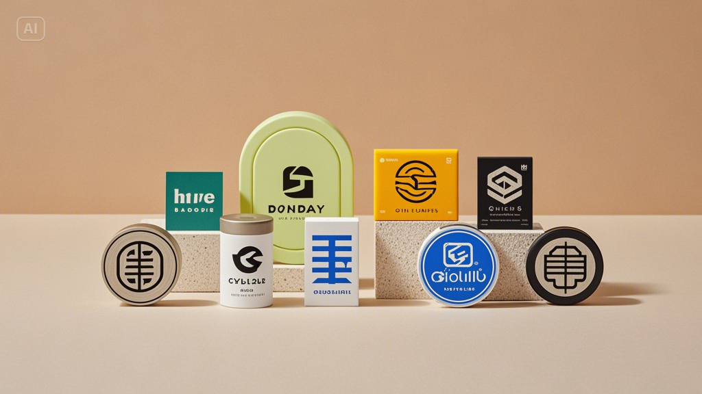
Key colors and their meanings in logo design
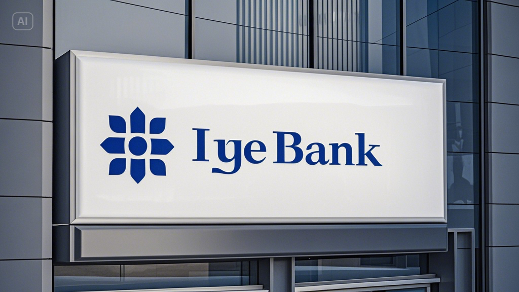
- Blue: trust and reliance
Blue color has always been a very good source of activity for those brands that want to show a sense of reliability and professionalism. It has widely spread in technologies, healthcare, and finance.
Best for: Banks, tech start-ups, and corporate brands.
How to use it: Pair light blue with white for friendliness, or go navy blue with silver for a more formal approach.
- Green: growth and sustainability
Green is a color for brands that are very eco-friendly, wellness-oriented, or targeted at the best soothing and refreshing color to identify nature.
Best for: Sustainable brands, health companies, and startups.
How to use it: Soft greens with earthy colors for a natural feel, or bright greens for a more modern look.
- Black: elegant and powerful
Sleek and sophisticated, black is timeless: perfect for brands that wish to emanate luxury and authority.
Best for: Fashion, luxury, and law firms.
How to use it: Accenting black with anything metallic like gold or silver provides a premium touch.

- Purple: creativity and sophistication
Purple is powerful in terms of calmness like blue and stimulates energy like red; hence, it is declared the color for innovation and luxury.
Best for: Beauty, tech, and luxury brands.
How to use it: Use light purples for play in design, or opt for darker shades when going for elegance and depth.

- Red: passion and urgency
Red is bold, energetic, and attention-grabbing, making it ideal for logos designed to stimulate excitement, passion, and urgency.
Best for: Food brands, entertainment, and retail.
How to use: It is best to apply red in moderation so as not to overrun the design; as for accents, red works well for icons or text.

- Yellow: Optimism and Creativity.
Warm and inviting full of vigor; yellow attracts and energizes. This is ideal for those in creative, approachable brands.
Best for: Education, creative services, and start-ups.
How to use it: Use secondary yellow to maintain readability but inject some vitality into design.

Use cases for color-driven logo designs to build a cohesive brand
- Creating a brand identity: A logo sets the tone for your brand. Use colors to create trust, excitement, or calmness based on your target audience.
- Marketing collateral: From brochures to business cards, your logo’s colors will impact the design of all your marketing materials. Along with your logo, complement with tools like a business card generator to create business cards that are harmonious with your brand image.
- Digital branding: The colors in your logo dictate the look and feel of your website, social media profiles, and email campaigns, ensuring a consistent digital presence.
Conclusion
Colors play a pivotal role in how your logo is perceived, making them an essential element of your branding strategy. Whether blue is to be trusted, red sparks excitement, or yellow shows creativity, the psychology behind color would make sure that your logo indeed leaves an imprint. Ready to create a very telling logo about your brand? Dreamina can help you do just that. With the best free AI image generator, designing your perfect logo is just a few clicks away. Give Dreamina a try today and bring your vision to life!

