
Smart signage doesn’t need to shout. It doesn’t need to glow like a Vegas casino or demand your undivided attention with spinning arrows and blinking bulbs in Floor Space. What it does need to do, though, is make the most of the space it’s in—especially when that space comes at a premium.
Whether you’re working with a cramped exhibition stand, a modest retail unit, or a compact foyer, squeezing maximum impact out of limited square footage is both an art and a science. And with the right signage approach, you can direct, inform, persuade—or all three—without cluttering your layout or overwhelming your visitors.
So how exactly does signage help maximise floor space? And what kinds of setups deliver the best results without monopolising square meters?
Readers also enjoyed this connected article—check it out.
Why Smart Signage Isn’t Just About Looks
It’s easy to think of signage as purely visual—something to catch the eye, match the branding, and look “polished.” But effective signage earns its keep in more subtle ways.
For starters, it can replace other, bulkier forms of communication. Think about a welcome desk that no longer needs a staff member thanks to a clearly marked freestanding sign, or a corner shelf cleared of leaflets because a vertical banner communicates the same message more effectively.
But even beyond saving space physically, good signage can reduce mental clutter. A well-placed sign eliminates hesitation. Visitors aren’t left wondering where to go next, what the product is, or what’s expected of them. They just move—smoothly, confidently, and without bottlenecks.
And in settings like trade shows or temporary installations, that kind of fluid movement is invaluable.
Designing Around Vertical Space
When square footage is limited, the obvious solution is to go up. Vertical design elements draw the eye while leaving the floor free—and in environments where every inch counts, this can be a game changer.
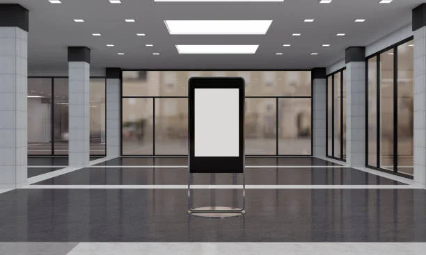
This is where floor-standing advertising displays earn their reputation. They’re tall, often modular, and designed specifically to make the most of height without spreading out horizontally. You can tuck one neatly into a corner, alongside a walkway, or beside a product display, and it’ll still do its job brilliantly—no sprawling footprint required.
But it’s not just about the footprint. Vertical signage works because people naturally scan from bottom to top (and vice versa), which gives you a layered canvas to work with. Start with a logo or visual identity at the top, flow into a key message in the middle, and close with a subtle call to action or QR code near the base. The hierarchy helps your message land, even when people are on the move.
Avoiding the “Visual Traffic Jam”
Ironically, signage that tries too hard can defeat its purpose. There’s a fine line between commanding attention and creating a visual traffic jam—especially when your floor space is already minimal.
A smart layout uses signage to reduce visual noise, not contribute to it. That means choosing clear fonts, high-contrast colours, and concise messaging. It also means avoiding redundancy. If your sign is telling people something they’ve already figured out, it’s just taking up space.
Instead, think about the kinds of questions a visitor might have in the first few seconds of entering a space. “What is this?” “Who’s running it?” “What’s the offer?” A single, vertical sign can answer all three—if it’s designed with intent.
Making Signage Work Harder
Maximising floor space doesn’t just mean saving room—it also means using that room as effectively as possible. That’s where multi-functional signage comes in.
A banner stand, for example, can double as a barrier, a privacy screen, or even a makeshift changing area in the right context. Some designs come with built-in literature holders, lighting, or interchangeable panels that let you adapt your messaging on the fly.
And because many of these options are portable and lightweight, you don’t have to commit long-term. You can set up for a day, a week, or a season, then pack everything down and redeploy elsewhere—no drilling, no heavy lifting, no wasted square metres.
It’s Not Just the Sign—It’s the System
All the signage in the world won’t help if it’s placed haphazardly. To truly maximise your floor space, signage has to be part of a system—a choreography of movement, attention, and flow.
That means thinking about sightlines, walking routes, and pauses. Where do people naturally stop? Where might they hesitate or turn around? Your signage should anticipate those moments and guide people through them effortlessly.
It also means resisting the urge to over-signpost. One thoughtfully placed display often does more than five cluttered ones. It’s a bit like punctuation: you want enough to help things make sense, but not so much that it interrupts the rhythm.
Final Thoughts: Less Floor, More Function
The idea that more signage equals more impact is a holdover from another era—an era where louder was better and attention spans were assumed to be microscopic. But in today’s environments, clarity trumps volume. Flow trumps flash.
So if you’re working with limited space, don’t think in terms of how much you can fit. Think about how little you need to say it well.
Smart signage isn’t about adding more—it’s about subtracting strategically. And when used thoughtfully, tools like floor-standing displays can help you do exactly that.
Browse all categories in one place by returning to 2A Magazine.