
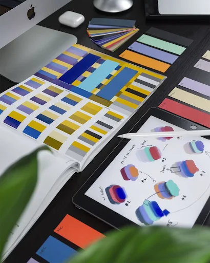
You spent days perfecting your latest graphic design project. The colors look perfect on your monitor screen. You send the file to the print shop and wait.
When the final physical banner arrives, the images look fuzzy and blocky. This common nightmare happens to design professionals and students alike. Pixels on a screen do not translate automatically to crisp ink on paper or vinyl.
You can fix this issue before sending your files to the press. Understanding a few technical setup steps will protect your hard work.
The Root Cause of Fuzzy Prints
Your computer display uses tiny light points to display clean shapes. Adjusting your file to the correct printing resolution helps your equipment read the data accurately – this simple step saves hours of troubleshooting. Physical mediums require tightly packed dots rather than digital illumination.
Digital artwork stretches when it lacks sufficient data density. A small image file looks great on a mobile phone, but breaks apart on a large format vinyl sheet. You need to prepare your canvas dimensions correctly from the very start.
Setting up the design software requires a clear understanding of your final output size. Creating a small canvas and stretching it later creates immediate pixelation. Your physical banners need dense graphical information to maintain crisp edges.
Deciphering Dots and Pixels
Many people confuse the terms used by designers and commercial printers. A medical research paper explained that dot measurements apply to physical printers, whereas pixel measurements belong to computer monitors. Mixing these two concepts can lead to major mistakes during file export.
Monitors display work using fixed pixel grids. Printers drop physical ink onto materials using precise physical droplets. Keeping these terms separated prevents unexpected sizing issues when your physical order ships.
You must adjust the pixel density before you export your final format. High-density files retain their clarity even when viewed from a close distance. Low-density files fail under close inspection.
Setting Guidelines for Visual Assets
Small graphics require much higher density values to look sharp on paper. An international scientific guide suggested that small photographs should measure at least 12 by 18 centimeters and utilize 600 dots per inch. This level of detail keeps small design components from turning into blurry shapes.
Large banners do not always need extreme density values. People view massive signage from several meters away. The human eye cannot separate individual ink dots from a long distance.
You can lower the density settings for massive billboards to save computer memory. Small portfolio pages require maximum settings since viewers hold them close to their faces. Matching the asset density to the viewing distance saves time.
Choosing the Right File Formats
Your choice of file extension changes how a print machine reads your lines. Vector files use mathematical formulas to calculate shapes instead of static pixel blocks. These files scale upward infinitely without losing a single ounce of sharpness.
Your choice of format protects your artwork during the final export process:
- PDF files preserve vector data and embedded fonts perfectly for commercial machinery.
- EPS documents allow large-scale sign makers to adjust sizing without rasterization.
- TIFF formats keep flat images uncompressed to avoid compression artifacts.
Using the correct extension keeps your lines clean. Printers prefer vector formats for text and logos. Raster formats work best for complex photographic backgrounds.
Avoiding the Pitfalls of Digital Upscaling
Stretching a low-quality file inside your editing software does not create new detail. The computer simply copies existing pixels to fill the larger canvas. This process creates a muddy look that appears highly amateurish on a finished banner.
You must start your document with the correct dimensions in place. Do not try to convert a small web graphic into a poster asset. The software cannot invent missing visual data out of nowhere.
If you must use a small asset, try using a dedicated AI upscaling tool. These tools attempt to predict missing details through advanced algorithms. Testing your graphics at full scale on your screen helps you spot pixelation early.
Preparing Your Color Workspace
Digital screens combine red, green, and blue light to generate images. Physical printing presses use cyan, magenta, yellow, and black ink to reproduce artwork. Converting your file format before sending it to the shop prevents unexpected shifts.
Failing to switch your color workspace results in dull or muddy outcomes. Printers struggle to match the bright neon shades seen on computer monitors. You can manage your project workspace by following these steps:
- Switch your document mode from RGB to CMYK before adding colors.
- Review color proofs on a calibrated monitor to verify accuracy.
- Utilize standard color-matching systems for exact brand replication.
This quick switch saves money on wasted materials. Your portfolio prints will match your screen version closely. Taking this step prevents bad surprises when you open the shipping box.
The Importance of Bleed and Margin Settings
Industrial cutting machines can shift slightly during the trimming phase. If your design stops exactly at the border, a thin white line might appear on the edges. Adding a bleed area extends your artwork past the final trim line.
Keep text and logos inside a safe zone away from the edge. This margin protects critical elements from getting chopped off during production. Most print shops request a 3 millimeter safety margin around the entire canvas.
Setting these boundaries takes less than 2 minutes in your layout application. It protects the balance of your design composition. Your banners will look balanced and professionally trimmed.
Checking Proofs Before Final Production
Always request digital or physical proof from your manufacturing partner. A proof allows you to inspect the layout at a smaller scale before investing cash. Spotting text typos or jagged edges now saves hundreds of dollars later.
Look closely at the gradients and fine lines on the proof sheet. Tiny details can disappear when ink meets heavy vinyl materials. Catching these flaws early allows you to fix the file resolution before the full run begins.
Discuss any concerns directly with the production team. They know how their specific machines handle complex gradients and fine patterns. Clear communication keeps your project on track.
Creating flawless large-format prints requires patience and attention to technical details. Setting your canvas size properly prevents pixelation from ruining your hard work. You can showcase your portfolio designs with total confidence by applying these file management steps. Your physical banners will look crisp and draw positive attention from every viewer.
Ready to scale? Unlock our full library of growth hacks at 2A Magazine.