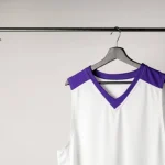
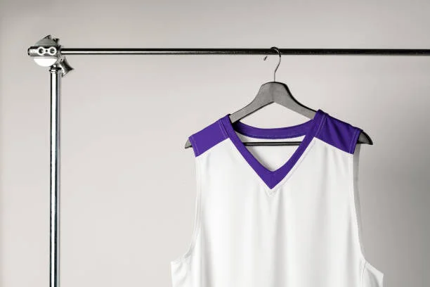
Custom jerseys have crossed from purely functional sportswear into something that overlaps with fashion. The design choices people make for team jerseys, event shirts, and branded apparel in NJ reflect aesthetic preferences as much as organizational identity. Getting the design right — and getting it produced correctly — is worth thinking about seriously Custom jersey design.
The Design Shift Happening in Custom Jerseys
Jersey aesthetics have evolved considerably. The generic block-letter team name on a solid color background is still out there, but it’s increasingly sharing space with more considered design approaches.
Vintage and retro styling. Inspired by classic team aesthetics, vintage jersey designs use distressed textures, retro typography, and muted color palettes. This look works particularly well for adult recreational leagues and community sports where nostalgia and personality are part of the appeal.
Bold graphic design. Large-scale graphics, geometric patterns, and strong typographic treatments have moved from streetwear into custom team apparel. Organizations that want their jerseys to feel current rather than institutional are leaning this direction.
Illustration-based mascots. Rather than generic clip art animals, teams are commissioning or sourcing custom illustrated mascots that have personality and specificity. A custom mascot illustration tells a story about the team in a way a generic stock icon doesn’t.
Minimalist approaches. Clean wordmarks, simple color blocking, and refined typography. For teams and organizations that want to look professional rather than flashy, minimalism signals intentionality.
Mixed typography. Combining a display font for the team name with a different weight or style for supporting text creates visual hierarchy and design sophistication that single-font designs lack.
What Production Method Enables Design Ambition
One reason custom jersey design in NJ has become more ambitious is that the dominant production method — Direct to Film (DTF) printing — doesn’t penalize design complexity.
Screen printing charges per color. A jersey design with six colors costs significantly more to produce than a two-color design. This per-color economics pushed designers and organizations toward simpler designs to control costs.
DTF has no per-color pricing. Full-color output — gradients, detailed illustrations, photographic textures — prints at the same cost as a simple two-color design. The only cost variable is transfer size and quantity, not design complexity.
For designers working on custom jersey designs in NJ, this changes the brief. You’re no longer designing around a color count budget. You can use the full palette, include gradient transitions, incorporate detailed illustrations, and combine multiple type treatments without the per-color cost making the design impractical.
DTF Jersey handles complex artwork directly — upload your PNG and the production handles the rest. Their ready-to-press design collection also has pre-designed options if you’re looking for starting points rather than building from scratch.
Design Principles Worth Following
Scale your design for the garment. A design that looks great at poster size often becomes illegible when printed at 10 inches on a shirt. Proof your design at actual print size before ordering. Fine text, tight detail work, and small design elements can disappear at shirt scale.
Respect the fabric color. Know whether your jersey is going on a light or dark garment before finalizing the design. Light elements (white text, light graphics) will only be visible on dark fabrics if there’s a proper white underbase in production — which DTF handles. Don’t assume a design made for a light shirt will work on a dark one without adjustment.
Consider the placement. Full front, left chest, full back, and sleeve placements all change how a design reads. A design meant for full-front placement has a different optimal composition than one meant for a left chest logo. Think about where the design sits on the body.
Typography at shirt scale. Fonts that look elegant at 12pt on a screen can be completely unreadable at a 3-inch print. Stick to typefaces with clear letterforms and adequate weight. Avoid thin strokes at small sizes.
Test before you commit. DTF suppliers with no minimums allow single-unit test orders. Before ordering 40 jerseys with a new design, press one test shirt. Color rendering on fabric is different from a screen preview. The test is worth the cost.
Getting Your Design Files Ready
For anyone working with a designer or creating their own artwork for custom jersey design in NJ, the output format matters.
PNG with transparent background at 300 DPI is the standard. Transparent background ensures only the design transfers to the garment — no white rectangle framing your artwork. 300 DPI ensures the output is sharp at the intended print size.
Vector-based artwork (from Illustrator or similar) can be exported to PNG at any size without losing sharpness. Raster-based artwork (from Photoshop) should be created at the actual print dimensions at 300 DPI from the start.
The design investment — whether you’re hiring a designer or working on it yourself — pays off across every jersey in the run. A well-designed jersey looks sharp in photographs, wears well as a team identity marker, and holds up as the organization’s visual representation throughout the season.
Don’t just skim the surface. See the whole ecosystem at 2A Magazine.