
A well-crafted image can stir emotions, provoke thought, or leave someone lost in its detail. But no matter how compelling the content may be, the frame surrounding it can either support or sabotage the experience. A frame isn’t just a physical border—it’s a filter through which viewers engage with the art. It shapes perception, controls focus, and acts as the silent partner to the artist’s voice. Without the right framing, a picture may never quite speak with the clarity it deserves. This relationship between content and its container has been overlooked far too often, even though their dialogue is crucial to the viewer’s experience.
Frames as the Bridge Between Art and Environment
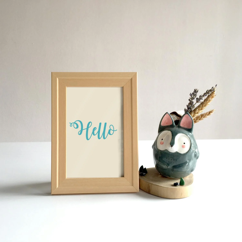
A frame holds more than just physical structure; it mediates between the artwork and its setting. It guides the eye and prepares the viewer to enter the world inside the picture. The contrast between the artwork and its frame forms a kind of transition zone—one that tempers how viewers approach the image. Whether subtle or ornate, this edge defines boundaries and prevents the visual message from becoming lost amid wallpaper, furniture, or lighting. In the middle of this balancing act lies the role of picture frames, providing both physical separation and aesthetic connection. These frames can echo the tones of a room or the materials within it, giving the artwork a place of belonging. Instead of feeling like a floating object, the art becomes rooted in the space, harmonized with its surroundings. The frame becomes a quiet narrator, setting the tone before the story begins.
Historical Intentions and Modern Expectations
Frames are rarely an afterthought in historical works. Artists and patrons often treated them as part of the overall composition. Carved wood, gold leaf, or elaborate motifs weren’t just decorative; they reflected the values and style of the period. Frames were sometimes designed in tandem with the artwork, considering not just form but meaning. They extended the voice of the piece and underscored its importance.
Modern framing can carry echoes of this mindset or intentionally reject it. Minimalist frames might strip things back to let the work breathe, while others mimic historical opulence to amplify a sense of grandeur. Whether chosen to match an era or to defy it, today’s frames still carry meaning. They become part of the viewing experience, conscious or not. In many cases, a poorly chosen frame can flatten or obscure the message, whereas one in tune with the artist’s voice can subtly elevate it.
Material Matters: Texture, Tone, and Weight
The material of a frame has more impact than most people realize. Wood offers warmth, metal can feel sleek or industrial, and acrylic might signal modernity or minimalism. These qualities influence perception even before the viewer processes the subject of the image. A heavy, dark frame may signal solemnity or tradition, while a lighter, thinner one might lean toward openness or spontaneity.
Texture contributes to this conversation, too. A glossy finish reflects light and draws attention, while a matte surface creates a more subdued presence. The frame can whisper or shout depending on these choices, working in tandem with the colors and forms inside the picture. Weight, both physical and visual, affects how grounded or airy the whole piece feels. When the frame echoes or contrasts with the image intentionally, a new layer of meaning unfolds.
Frame Shapes and Spatial Interaction
The shape and depth of a frame can influence how viewers engage with the piece. Deep-set frames can give artwork a shadow-box effect, adding dimension and pulling the image inward. Thin, flat profiles may suggest immediacy, encouraging a more direct interaction. The bevel of a frame, its inward or outward tilt, can direct the eye toward or away from the image, subtly shaping attention and interpretation.
Unusual shapes—round, oval, or custom cut—can change the context entirely. They might invoke nostalgia or challenge standard viewing patterns. Spatial interaction, too, plays a role. A thick frame may isolate the picture from the wall, turning it into a standalone object. A thinner border might allow for more integration, letting the art merge slightly with its surroundings. Either approach has its place, depending on the desired effect.
Color and Contrast as Visual Dialogue

Color often speaks before content. A frame’s hue can influence mood, direct focus, or evoke emotion long before a viewer understands what they’re looking at. High-contrast pairings may heighten drama, while tonal harmony can generate calm. The wrong shade can create dissonance, muddling the message and dulling impact.
A white frame around a monochrome photo might sharpen its clarity, while the same frame around a brightly colored piece could wash it out. Dark tones can add gravity, but only if the image has the strength to balance them. Even the space between the edge of the image and the start of the frame—the mat—plays a part in this dialogue. It adds breathing room, framing the frame itself, so to speak. Every decision in color and contrast contributes to how the work is received.